

Background
Back in 2013, as part of a University project, I designed an interpretation of the ‘Two Lines English Egyptian’ typeface which is thought to be the first printing sans-serif typeface to have been produced. The typeface was originally created by the Caslon foundry of Salisbury Square, run by William Caslon IV in around or possibly just before 1816.
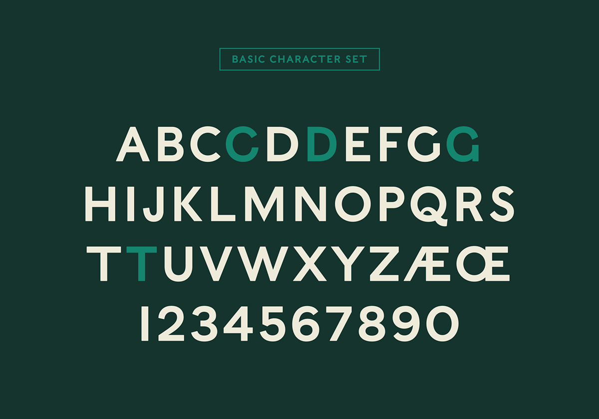
I designed the first version of Two Lines English Egyptian for use in a short film that told the story of the English typeface designer William Caslon I and his printing legacy. At the time, I only designed 26 uppercase letters using the limited and largely incomplete specimens, but since then I've wanted to extend the design into a more complete typeface with numerals, punctuation, and diacritics.
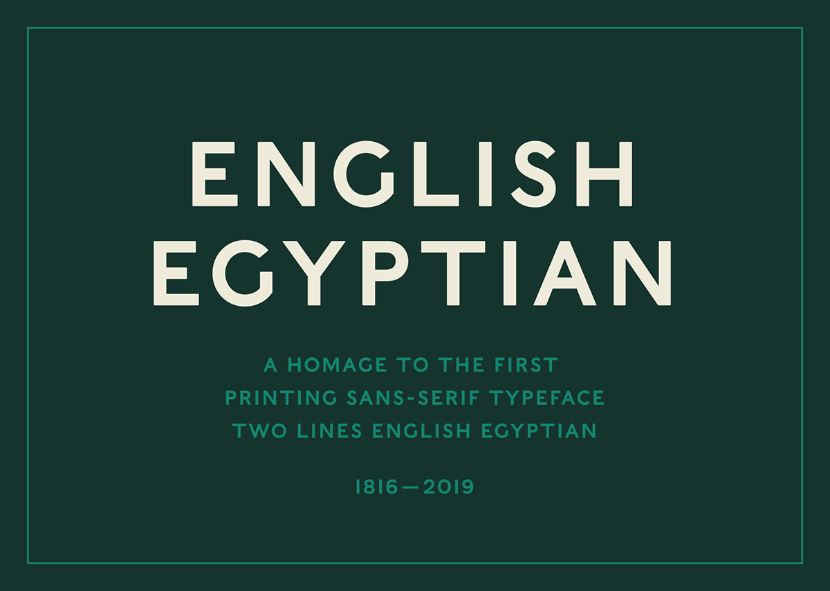
English Egyptian is my homage to William Caslon IV’s pioneering sans-serif.


A Brief History
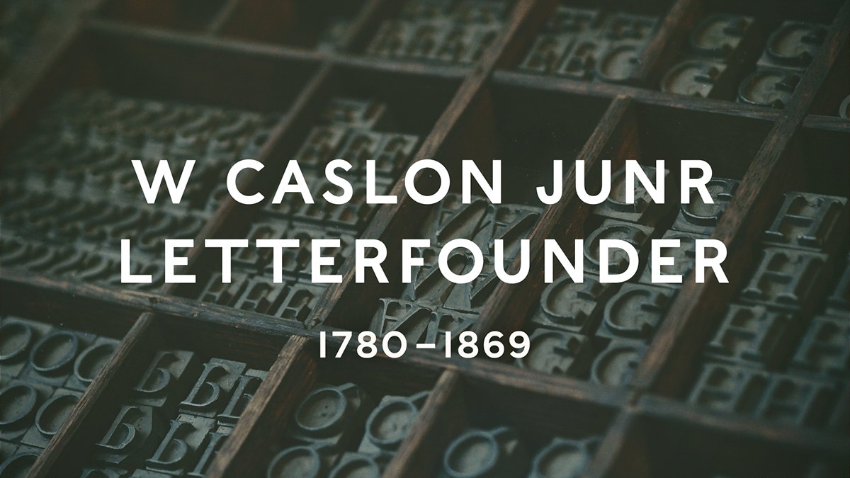
In around 1816, the first general-purpose sans-serif typeface was created by the Caslon Foundry of Salisbury Square, London, run by William Caslon IV. The earliest printed specimens of this typeface showcase 14 uppercase letters (no numerals or punctuation) reading ‘W CASLON JUNR LETTERFOUNDER’. The typeface was cataloged under the name Two Lines English Egyptian – "Two Lines English" referring to its size (around 28 modern points) and "Egyptian" was the common name given to sans-serif lettering at the time. Considering its historical importance, the specimen is rather inconspicuously sandwiched between larger, more ornate, serifed titling capitals suggesting the foundry didn’t consider the design to be of any great significance or worthy of more prominence.
The roots of the typeface can be found in the sans-serif lettering in block capitals that were gaining popularity over the past few decades and were being used for architectural inscriptions, engravings, and by sign painters. Despite the apparent interest in sans-serif lettering at the time, Caslon's Egyptian doesn’t appear to have been a particularly successful font as there have been no contemporary uses of it ever found. It’s also not entirely clear why the font was created in the first place, but it’s been suggested by historian James Mosley, that it may have been produced for a private commission.


Additional Information
English Egyptian is an interpretation of 'Two Lines English Egyptian' originally created by the Caslon Foundry of Salisbury Square, London, in around 1816. The design is based on the type specimen found in the 'Blake, Garnett & Co. Printing Types', c.1819, courtesy of St. Brides Printing Library. It has been designed for fun and doesn't claim to be historically accurate.
All mockups designed by Jonathan Martin, 2019.
Photos of 'Blake, Garnett & Co. Printing Types' by Olly Sorsby, 2013.
Additional photo by Natalia Y on Unplash.
The secondary fonts used in the mock-ups are Brandon Text Regular and Black.
Please feel free to get in touch for more information on English Egyptian.
Thanks for watching!


